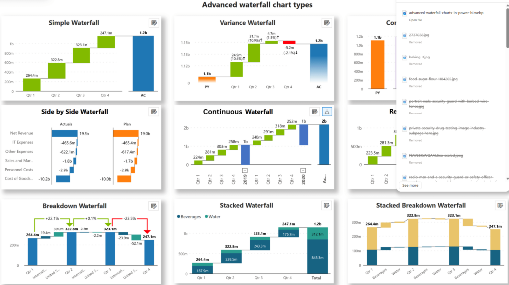
Advanced Power BI waterfall charts do more than show increases and decreases. They help explain how values change across time, categories, or business events in a way that is easier to interpret than a static total alone.
When built well, they can clarify profit movements, cash flow shifts, and budget variances while keeping the logic behind the numbers visible.
This article covers the advanced features that make waterfall charts more useful, including breakdown categories, subtotals, running totals, and threshold lines. It also looks at common business applications and practical fixes that help keep these visuals accurate, readable, and reliable.
Advanced Features for Accurate Analysis
Power BI waterfall charts become much more useful when you move beyond the default setup. With the right structure and formatting, they can show not just change, but the drivers behind that change.
Breakdown Categories
Breakdown categories help explain what is driving movement between one stage and the next. Instead of showing a single change for a period or category, the chart can split that change into contributing segments such as territory, product line, business unit, or cost type.
This makes the analysis more informative because users can see not only that a value changed, but also what contributed most to the movement. In a sales view, for example, a monthly increase might be broken down by region. In a cost analysis, an unfavorable variance might be split by department or expense category.
Power BI also allows you to limit how many breakdowns appear directly in the chart, which helps reduce clutter. Smaller contributors can be grouped into an “Other” category so the visual stays focused on the biggest drivers.
For advanced reporting approaches, Zebra BI can help build Power BI waterfall charts with richer breakdowns, clearer business logic, and more structured financial presentations.
Subtotals and Running Totals
Subtotals help users pause at meaningful points in the sequence and see how values accumulate before the chart moves on. This is especially useful in financial reporting, where a report may need to show a starting value, several intermediate changes, and one or more subtotal stages before the final result.
Running totals add further clarity by showing how the cumulative value changes step by step. Instead of reading each bar as an isolated number, users can follow the progression across the full chart.
Together, subtotals and running totals make waterfall charts better suited to reporting scenarios where the sequence matters. They help the chart tell a structured story rather than presenting a list of disconnected movements.
Reference Lines and Thresholds
Reference lines and thresholds add context to the chart by showing where values stand relative to a target, standard, or expected range. This makes it easier to understand whether a change is favorable, neutral, or a cause for concern.
A threshold might represent a budget target, profit benchmark, or acceptable cost range. When used well, it gives users an immediate point of comparison instead of forcing them to interpret the values without context.
These elements are particularly useful in dashboards and management reports, where stakeholders often need to assess performance quickly without reading detailed notes.
Missing or Calculated Values
Accurate visuals depend on accurate data. Missing values, poorly structured measures, or inconsistent calculation logic can quickly make a waterfall chart misleading.
Null values should be reviewed before the visual is built. In some cases, replacing missing values may be appropriate. In others, the better choice is to leave them out or revise the underlying data model. The right approach depends on the type of analysis and how the missing data affects the result.
Calculated values also need careful handling. Some waterfall scenarios require custom measures, especially when the chart needs to display variance logic, grouped movements, or disconnected categories.
When this happens, it is important to structure the calculation clearly so the chart reflects the intended business logic and not just the raw data output.
Common Use Cases for Business Reporting
Waterfall charts are especially useful in business reporting because they show both the result and the explanation behind it. That makes them valuable in several common reporting scenarios.
Analyzing Profit and Loss Statements
A waterfall chart is well-suited to profit and loss analysis because it shows how revenue is reduced by costs and expenses until the final profit figure is reached. Instead of scanning rows in a table, users can follow the sequence visually.
For example, a report might begin with gross revenue, subtract the cost of goods sold, operating expenses, taxes, and one-time costs, and end with net income. The chart makes it much easier to explain where the biggest shifts happened and what had the strongest effect on the final result.
Tracking Budget Variance Over Time
Budget variance analysis becomes clearer when a waterfall chart shows how actual performance moved above or below the plan. It can highlight which periods, categories, or operational factors contributed most to the difference.
This is useful for management reporting because the chart turns a simple variance number into a visual explanation. Instead of just showing that actuals missed the budget, it shows where the gap came from and how much each driver contributed.
Monitoring Cash Flow Changes
Cash flow is a natural fit for waterfall charts because the visual format mirrors how cash moves through a business. A chart can begin with an opening balance, add operating inflows, subtract investments, include financing changes, and finish with the closing balance.
That sequence helps users understand liquidity movement at a glance. It also makes the report easier to explain in meetings because the visual follows the same logic as the business process it represents.
Comparing Year-over-Year Performance
Year-over-year analysis often benefits from a waterfall chart when the goal is to explain the drivers behind the change rather than only compare totals. A chart can show the starting result from the prior year, the main positive and negative contributors, and the ending result for the current year.
This is especially helpful when a simple percentage change does not explain enough. The waterfall format reveals which products, channels, regions, or expense categories pushed performance up or down.
Troubleshooting and Performance Optimization
Even well-designed waterfall charts can run into problems if the data model, sorting, or visual settings are not handled carefully. Small issues in setup can make the chart harder to read or less accurate than it appears.
Fixing Data Display Issues
A common issue is when totals or intermediate bars do not display as expected. This can happen because of formatting settings, incorrect relationships between tables, or measures that behave differently inside a visual than they do in a table.
When this happens, check the chart settings first, then review the data model and measure logic. It is often helpful to test the same measure in a simple table visual before returning it to the waterfall chart. That makes it easier to spot whether the problem comes from the calculation itself or the way the chart is interpreting it.
Improving Chart Load Times
Large datasets and too many breakdown segments can slow down performance. If the chart includes every small contributor, it may become both cluttered and slower to render.
One practical fix is to limit the number of displayed breakdowns and group minor contributors into an “Other” category. This keeps the chart readable and reduces the processing burden. Cleaner visuals are often faster visuals.
Resolving Sorting and Ordering Problems
Sorting problems can make a waterfall chart confusing, even when the values are correct. Categories may appear alphabetically instead of in business order, or repeated categories may cause conflicts in the sort logic.
The best fix is to create a dedicated sort-order column using whole numbers and make sure each category maps to one clear sorting value. This is especially important when the chart needs to follow a financial or operational sequence rather than a default alphabetical one.
Good sorting is not a minor detail in waterfall reporting. It directly affects whether the story reads logically from start to finish.
Conclusion
Advanced Power BI waterfall charts help turn complex changes into a clear visual sequence. Features such as breakdown categories, subtotals, running totals, and thresholds make it easier to understand what changed, why it changed, and where the biggest drivers sit.
In business reporting, this makes waterfall charts especially useful for profit analysis, cash flow tracking, variance reporting, and year-over-year comparisons.
Accuracy also depends on the setup behind the visual, including clean data, reliable calculations, sensible sorting, and practical performance choices. When those pieces are in place, waterfall charts become a strong reporting tool that helps teams interpret change with more clarity and confidence.